
Ardingly 2026 - by David
So we ran into Eileen at Ardingly, and she asked if I’d like to put down some thoughts from the perspective of a partner…
Let me start by saying I’m obviously not an expert, but I’ve absorbed a few things over the years from observing Deirdre’s projects, going along to this and other quilt shows, and photographing the entries for the biennial exhibition. So I actually quite enjoy spending a few hours at Ardingly every year, and I approach it like an art exhibition and just see what I like of the work on display.
To explain where I’m coming form, the overall view I’ve formed is that, as quilts are generally made up from elements with quite well-defined edges, they don’t really lend themselves to attempts at realistic images or portraits. Without wanting to sound like The Observer colour supplement, it seems to me much of the beauty of quilting is derived from symmetry and the rhythm and discipline of repeated patterns; images only really work if they are a bit abstract or can be reduced to fairly simple shapes.
Deirdre puts it a different way – there’s quilting, and there’s textile art, but where is the dividing line and what is the difference?
Heading to the displays, we started with the Journal Quilt Challenge, in which entrants were asked to make two A4 size quilts on the theme The Essence of Nature.
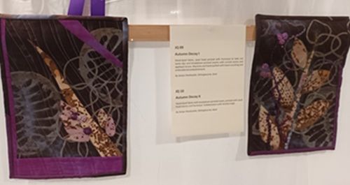
There was a wide variety of approaches to this, including looking at underlying patterns in nature, so I liked a spiral based on the mathematical Fibonacci series (JQ46). There was a quite psychedelic entry using the shapes of petals and birds, very San Francisco ’67 (JQ 37 and 38); a representation of earth, air, fire and water (JQ 27) and a pair of successful spring and winter landscapes (JQ 17 and 18) – strong, simple shapes. Another pictorial one that worked showed birds in a birch tree (JQ 39 and 40). But my favourites in this section were more abstract – Autumn Decay I and II (JQ 09 and 10) and Aurora (JQ 08). It struck me that an avenue with a lot more scope for exploring in this area could be to focus in more closely on the structure of a single leaf, a bird’s plumage, or a butterfly’s wing.
Modern Quilts for Modern Magazines was a selection of quilts by Mandy Munroe, who produced a regular monthly design for Popular Patchwork magazine for 12 years – a prodigious work rate! These struck me as the most conventional on display, which was perhaps what the magazine wanted, but I particularly liked Stack, inspired by seeing stacks of shipping containers at a port: interesting colours and a bit of asymmetry.
One of the quilts in the journal section was a portrait of Sir David Attenborough, which, illustrating the difficulties of attempting realism, had a a bit of a Cubist look. An entry in Exe Valley Contemporary Quilt Group’s Triangle Challenge used that effect to its advantage to produce a work based on George Braque’s Cubist painting Violin and Palette (EV 15). Another avenue worth exploring further, I thought.
Another inventive idea in this section was a sort of map of the Exe estuary (EV16) in which triangles represented the “cardinal buoys” warning mariners of dangerous rocks. My favourite in this section also had a nautical theme, but I’ll come back to it later.
I didn’t really go for Sue Jennings’ wall-sized One Block Wonders – too pictorial for my tastes, and too strong in the colours used. They reminded me of fantasy novel covers, which our daughter would have liked, for instance, but not my cup of tea. I much preferred her Colourwash Quilts, made from scraps and rough cut but with a lot of attention to harmony of colour. I particularly liked a blue/green one inspired by Monet’s waterlilies paintings (CW 02).
In the same way Gillian Travis’s Journeys in Stitch, inspired by things she’d seen over many years travelling, didn’t really grab me. These were mostly small and pictorial, like quilted postcards, and while admiring the work and creativity that had gone into them, I felt they didn’t play to quilting’s strengths. I did, however, like some of the larger quilts in this section – a series of Venetian Domes (GT 13); and also a pair called Mexican Doors and Alsace Windows (GT 11 and GT 03), because they were made up of repeated but varying shapes and patterns.
Reflections was the title of a challenge by Threaded Together. Some of the contributors had taken this literally and others figuratively – “a reflection on my recent trip to X”, for example. I thought this was perhaps interpreting the brief a bit too loosely…?
Overall, though, I thought this section, alongside the Essence of Nature challenge, were the two most impressive in the display. Of the reflections I particularly liked TT 07, Finding Flamingos (very abstract) and also After the Party (TT 11), inspired by the dimming of party lights. With beautiful vibrant colours, but almost completely abstract and with no actual blocks, this exhibit was also perhaps the least like a conventional quilt in the whole show. My favourite was TT 01, an image of a boat’s hull reflected in Phewa Lake in Nepal. But it was equalled by a quilt that wasn’t in this section at all. This was Moonlight Sail (EV 14) from the Triangles challenge – strong triangular sail shapes in pinks and lilacs, a moon, and I think the best rendition of reflections in the show.
Deirdre always asks me to choose which one I’d take home: not easy with such a diverse range, but it would be either of these two last mentioned, or Finding Flamingos, which, having been looking at my photos from the show while writing this, I find is growing on me over time.
After all this art appreciation I generally chill in the café with a cheese sandwich, a Kit Kat, an old fashioned filter coffee and the newspaper, while Deirdre hits the fabric stalls downstairs. If I were to *reflect* on the show (ahem), I think I’d say it wasn’t a classic Ardingly compared with some previous years, but a lot of interesting work nevertheless. And hopefully inspiration!
And so onward to 2027…


JQ 17 and 18
JQ 9 and 10
TT 11


TT 01
TT 07
Stack
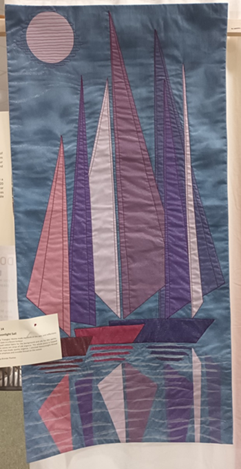


EV 14
GT 11
CW 02